Font Specimen – Awareness Serif
BA Design Warm-Up – Foundation Course
2022
semester

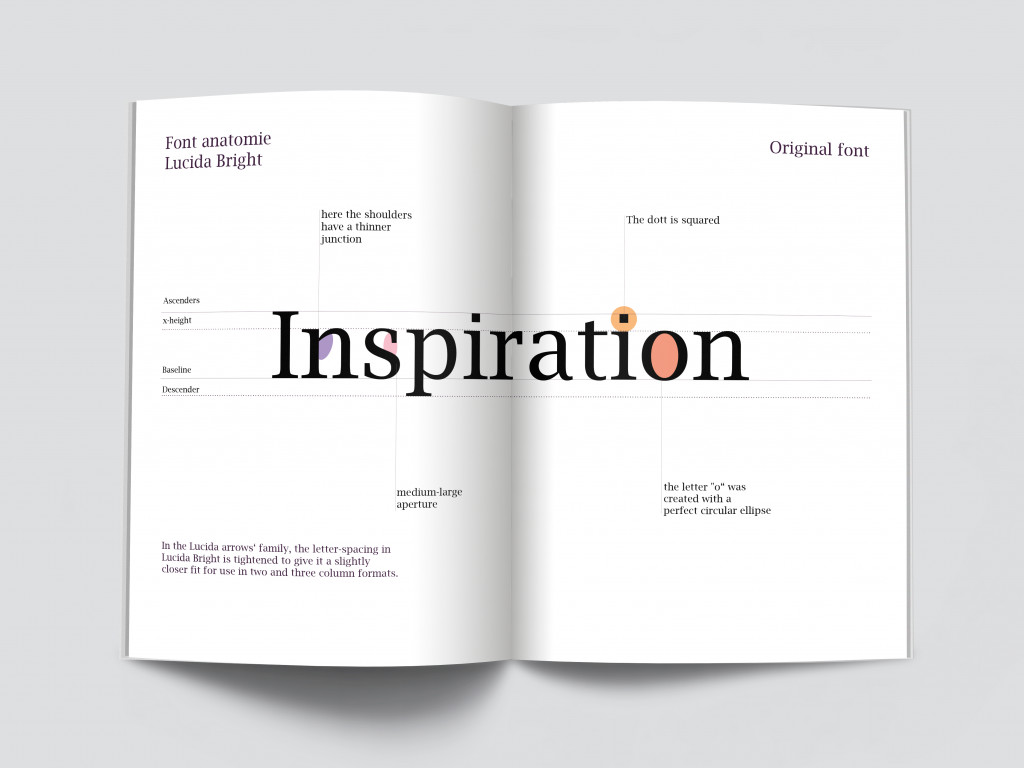
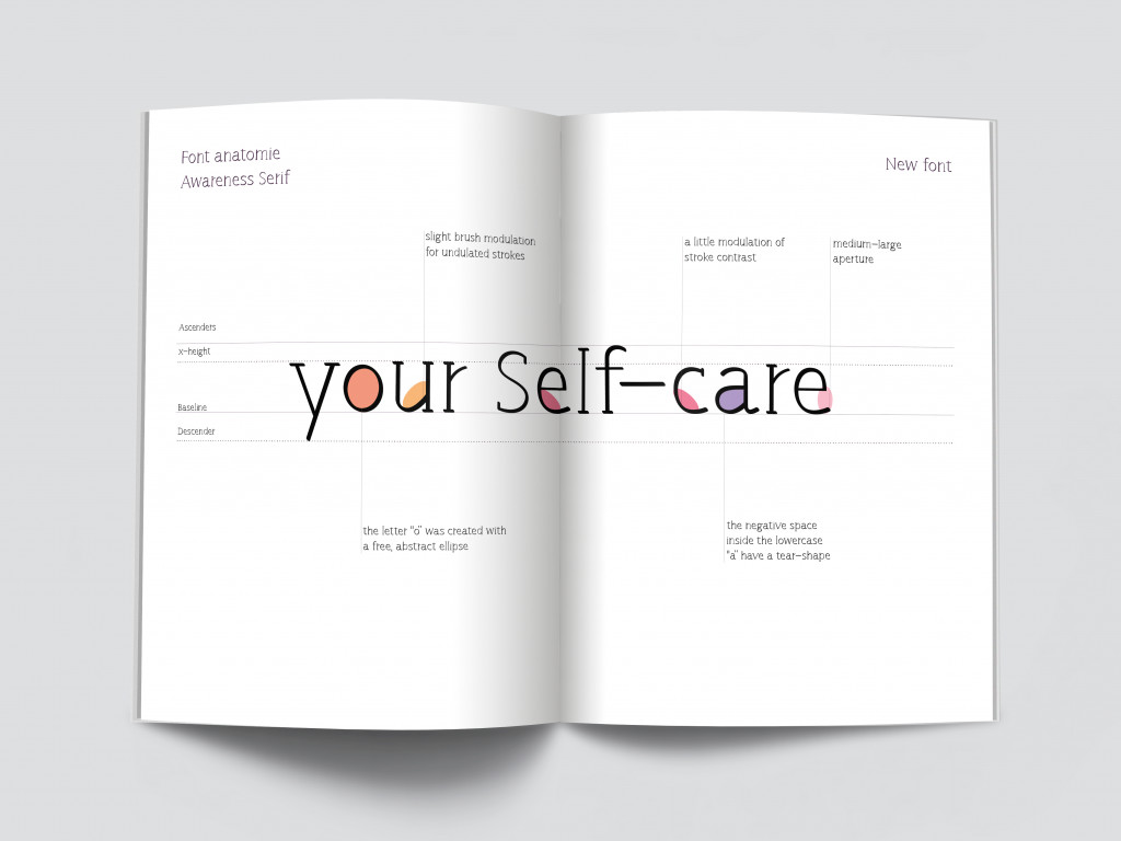
In the Lucida arrows‘ family, the letter-spacing in Lucida Bright is tightened to give it a slightly closer fit for use in two and three column formats. From here I started my disciplinary path in the creation of the font: awareness.
Features such as the square dot for the letter “i” and the perfect circular ellipse created for the letter “o” are replaced in awareness with a free and abstract ellipse, a round dot and a a “tear-shape” in the negative space inside the lowercase letters. A medium to large aperture is repeated in both sources although, compared to Lucida Bright, Awareness has a lighter modulation of the brush for ondulated strokes and a small modulation of the contrast of the stroke itself.
Specifically Awareness Serif is the result of Bracketed assymetrical and symetrical serif, in some cases double or singular, with infact only an ecceptionts for the letters “a” “e” “o” with their respectively accents, where they don’t appear.
I personally appreciated the work done, “Awareness” of ourselves and our own abilities, which I learned during this course and which allowed me to experiment and develop completely new different techniques.


