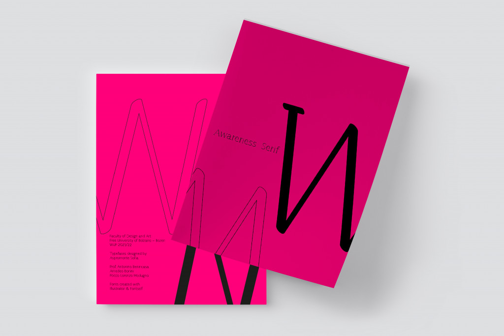
Font Specimen – Awareness Sans
BA Design Warm-Up – Foundation Course
2022
semester

In the Lucida arrows‘ family, the letter-spacing in Lucida Bright is tightened to give it a slightly closer fit for use in two and three column formats. From here I started my disciplinary path in the creation of the font: awareness.
Features such as the square dot for the letter “i” and the perfect circular ellipse created for the letter “o” are replaced in awareness with a free and abstract ellipse, a round dot and a a “tear-shape” in the negative space inside the lowercase letters. A medium to large aperture is repeated in both sources although, compared to Lucida Bright, Awareness has a lighter modulation of the brush for ondulated strokes and a small modulation of the contrast of the stroke itself. Specifically in Awareness Sans Serif, the terminals have oblique cuts ranging from 12 to 83 degrees.
I personally appreciated the work done, “Awareness” of ourselves and our own abilities, which I learned during this course and which allowed me to experiment and develop completely new different techniques.


