Font Specimen – Belgrade Serif
BA Design Warm-Up – Foundation Course
2019
semester

Font Specimen WUP 2020 (Visual Communication)
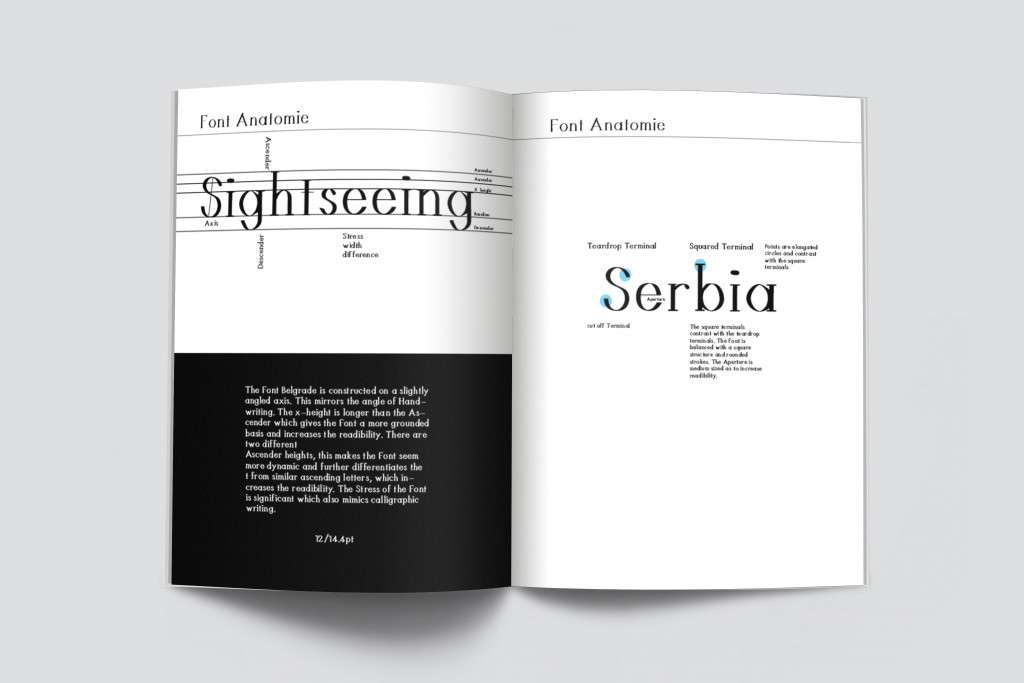
The Font Belgrade Serif is constructed on a slight angled axis. This mirrors the angle of handwriting. The x height is longer than the ascenders which gives the font a more grounded basis and increases the readability. There are two different ascender heights, this makes the font seem more dynamic and further differentiates the t from similar ascending letters. This also increases the visibility. The stress of the font is significant which also mimics calligraphic writing.
Die Schriftart Belgrade Serif ist auf einer leicht abgewinkelten Achse aufgebaut. Dies spiegelt den Winkel der Handschrift wider. Die x-Höhe ist länger als die Aufsteiger, was der Schrift eine fundiertere Basis verleiht und die Lesbarkeit verbessert. Es gibt zwei verschiedene Aufstiegshöhen. Dadurch wirkt die Schrift dynamischer und unterscheidet das t weiter von ähnlichen aufsteigenden Buchstaben. Dies erhöht auch die Sichtbarkeit. Die Schrift ahmt das kalligraphische Schreiben nach.