Font Specimen – Grannhild Sans
BA Design Warm-Up – Foundation Course
2019
semester
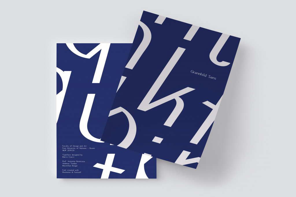
Grannhild Sans
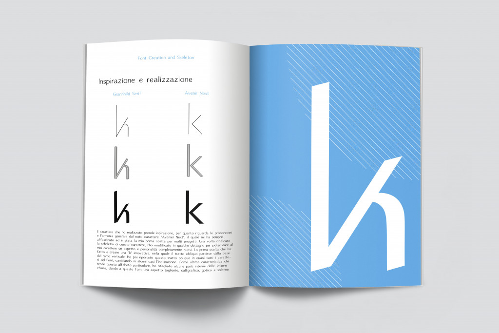
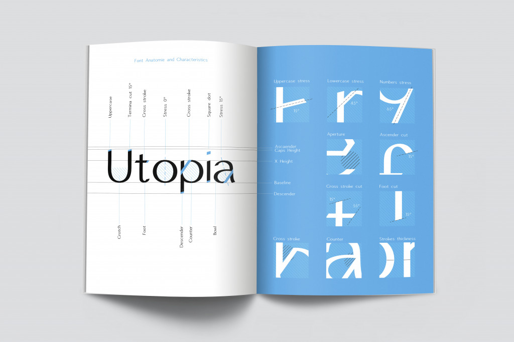
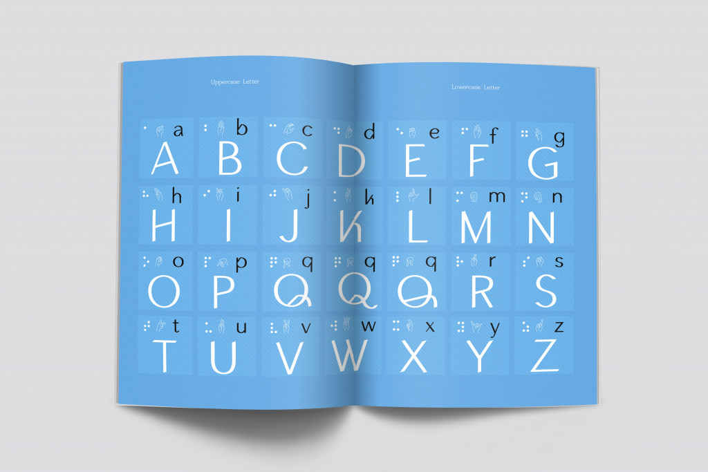
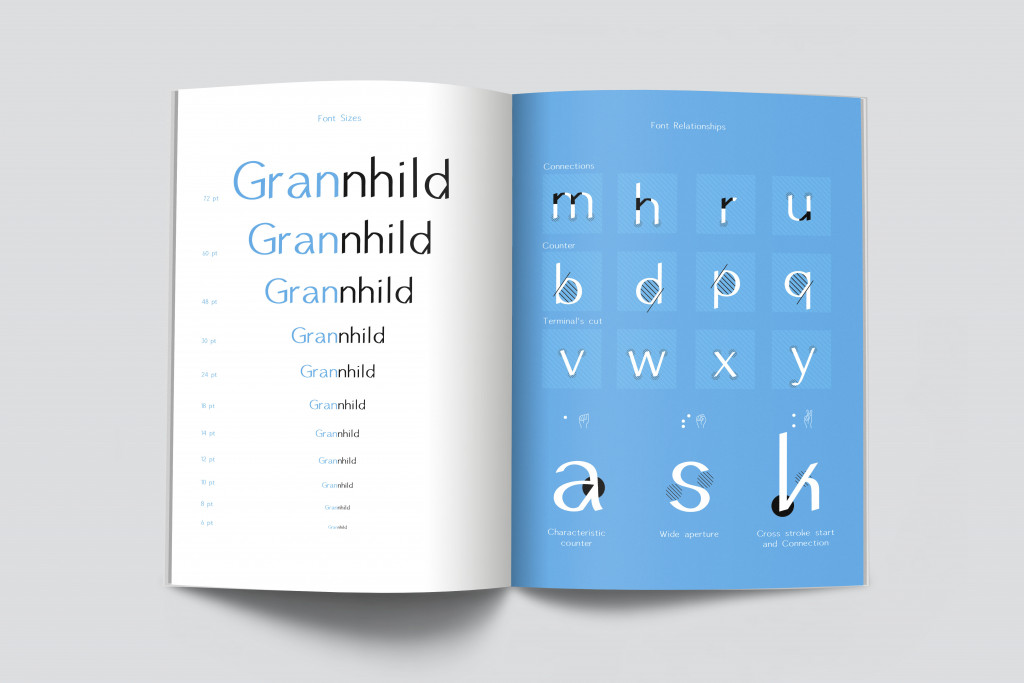
The Font I created is inspired, in terms of proportions and general harmony, by the well-known “Avenier Next” character, which has always fascinated me and was my first choice for many projects. Once I traced the skeleton of this character, I modified it in some details to give my character a completely new look and personality. The first choice I made was to create an innovative “k”, in which the oblique stroke started from the base of the vertical branch. I then brought back this oblique stroke in almost all the characters of the Font, changing in some cases the inclination. As a last feature that makes this alphabet particular, I cut out some internal parts of the closed letters, giving this font a sharp, ancient, calligraphic, gothic and solemn look.
The skeleton has faithfully followed the starting character, with some variations. What makes “Grannhild Sans” completely different from its predecessor is the addition of an oblique stroke that is clearly visible with the applied graphic brushes.
The choice of brushes was influenced by the inclination of the oblique strokes. Here are the three main brushes:
closed strokes: 0°, 40%, 8 pt
arched sections: 15°, 40%, 7.3 pt
right strokes: 0°, 40%, 7 pt
After I expanded the stroke and made the internal cut characteristic of this character, “Grannhild Sans” is completely detached from its origin and appears as an organic and proportionate character, legible, with an ancient and gothic memory but with a modern look, caused by the hybrid graces, not present with constancy.
