Font Specimen – Piliers Serif
BA Design Warm-Up – Foundation Course
2022
semester

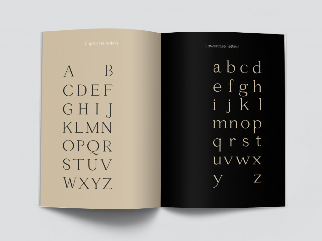
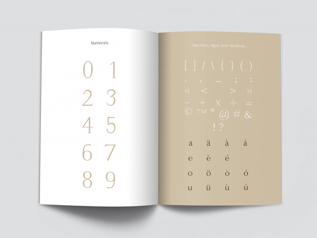
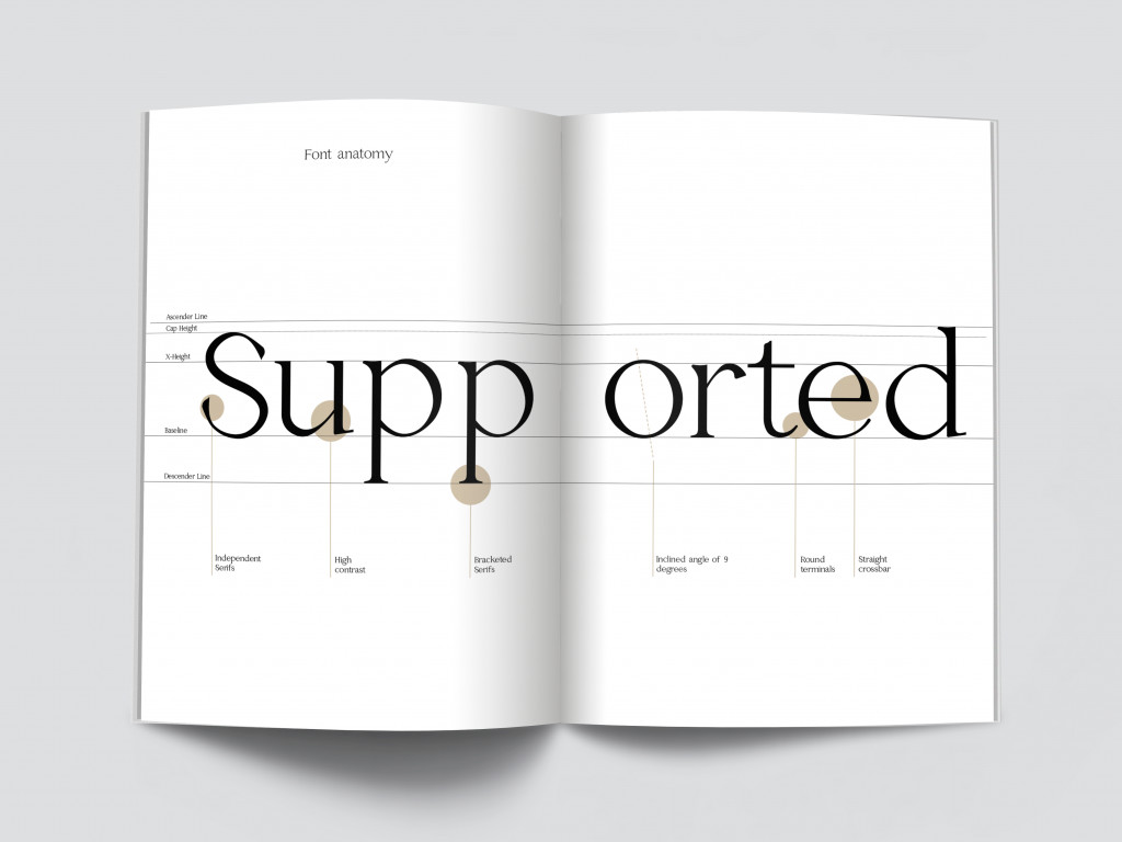
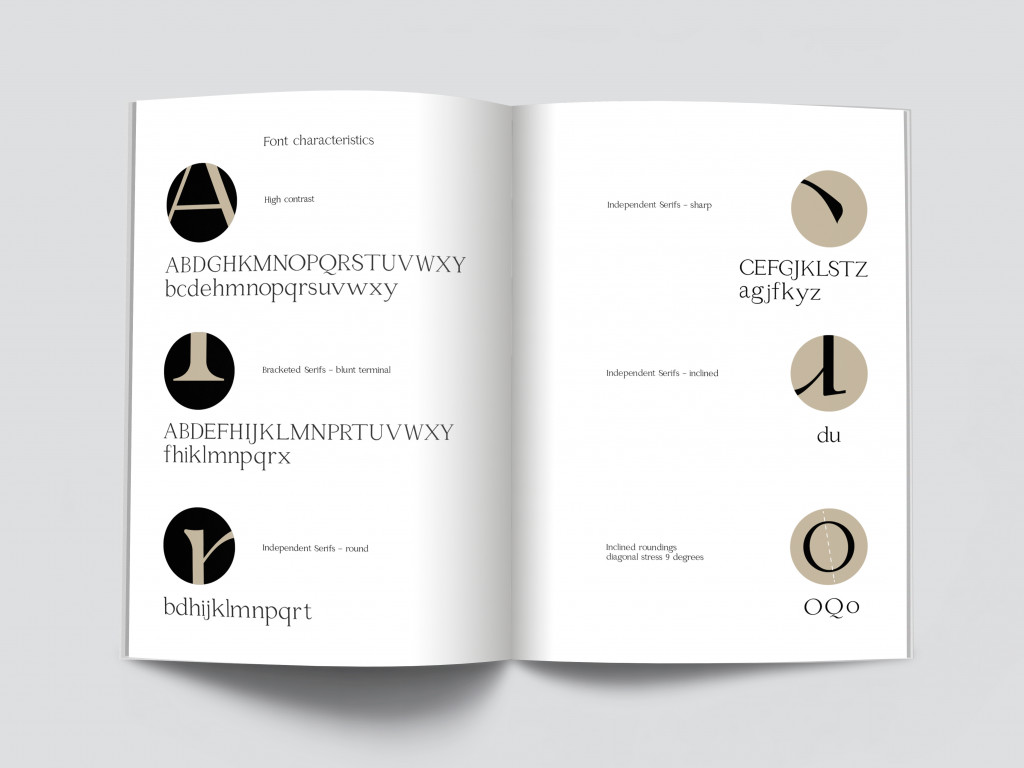
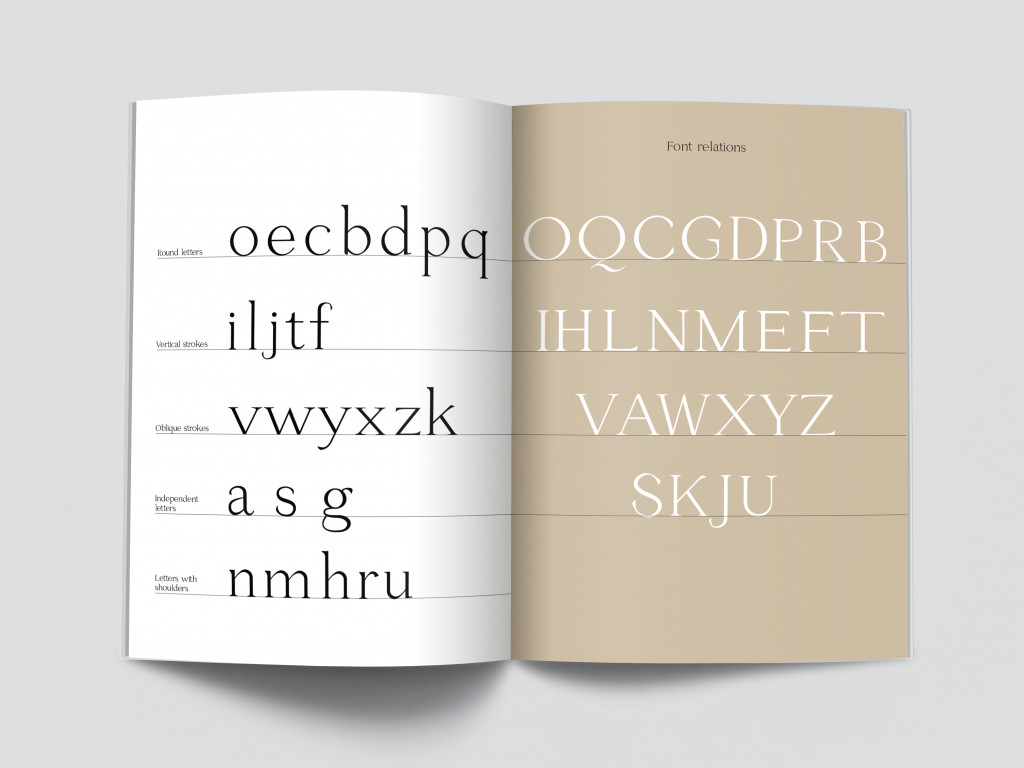
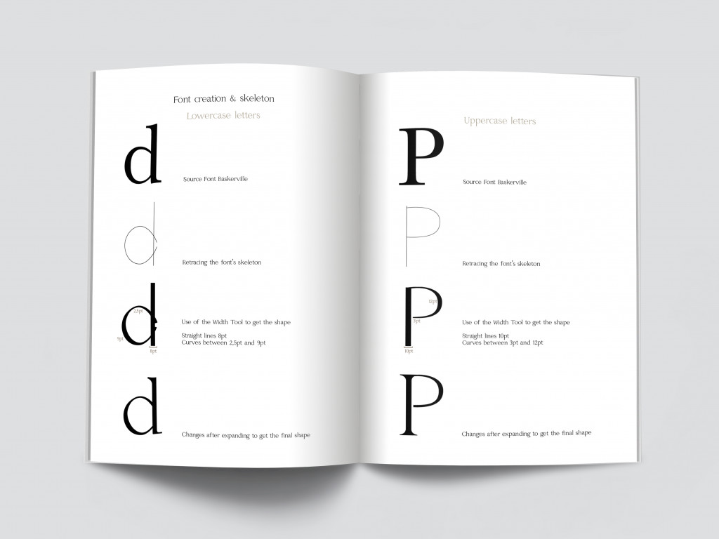
Piliers is the first serif typeface I designed. The font I created is inspired, in terms of proportions and general harmony by the ‘Baskerville’ character, a typeface that originated as a Baroque Antiqua in 1754. I decided to take ‘Baskerville’ as a source font, because of the strong stroke contrasts that I found interesting and because of its, in my eyes, elegant character. Once I traced the skeleton of this character, I modified it, adding new details, to give my font new characteristics and a new look. The letters of my font resemble to columns, that’s why I decided to call it ‘piliers’, which is French and means ‘pillars’. My font is characterised by high contrast, round, but in some cases irregular terminals, bracketed serifs and an inclination in the round letters of 9 degrees.
After expanding the strokes, ‘Piliers Serif’ does not resemble at all to the source font and appears as a unique typeface, legible, but especially suitable for titles, because of its small, interesting details and its high contrast. In order to create the font digitally, I used Adobe Illustrator and its Plug-in Fontself. In order to present my font, I created this specimen.
