Tako blizu, ali tako daleko
BA Visual Communication Project
2022
semester

“Tako blizu, ali tako daleko”, croatian for “So near, but so far”
Istria, Croatia, early 2000s. In various schools in this bilingual region several events of division occurred: doors being closed and walls being built between Croatian and Italian parts of school buildings. Discussions have been made and possible reasons have been supposed, but this project is not about this. It is about imagining a reaction by the students that lived these events, in the shape of a poster-hanging protest.
What I have created is a series of serigraphy printed posters that deal with the topic of division. Inspired by the works of Atelier Populaire during the protests of May ’68 in Paris, the posters have simple depictions and words that should, through the different layers of meaning, provoke critical thoughts about the mentioned events in the head of the viewer.
On a denotative level these posters are about doors and walls, but on a connotative level they are about what building a wall can change, what closing a door can bring and what a region with divisions similar to these ones in everyday life feels like. These posters tell the not so nice truth of the identity of Istria: a region that on the outside looks like a school in which Italians and Croatians happily cohabit, but on the inside has plenty of dividing walls and closed doors.
The posters are divided into two groups that deal with two different motifs: the door and the wall.
Wall
COME IN UN GIOCO (Like in a Game)
The depicted brick is an icon of the classic LEGO brick and a symbol of the act of easily building and destroying something several times (in this case a wall), which is a very typical action when playing with LEGO bricks.
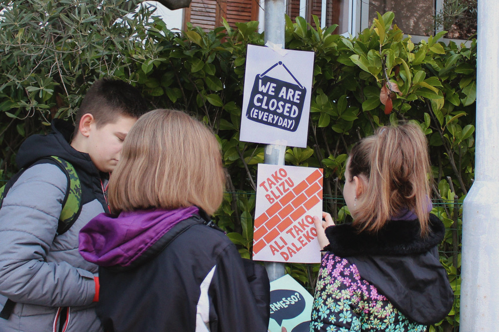
TAKO BLIZU, ALI TAKO DALEKO (So near, but so far)
The three rows of bricks are an index for a wall, which is a symbol of division. The phrase refers to how distant the two parts of the school feel after the wall has been built, even if they are attached to each other.
ZID SRAMA (Wall of Shame)
The name “wall of shame” was given by the locals and eventually used in different newspaper articles. The letters are shaped like holes, but at the same time like graffiti writings, both made by students on the built wall.
MIND THE GAP
The icon in this poster represents a stairway seen through a hole in a wall, inspired by photos published in different newspapers at that time. The phrase has two meanings: to mind the fact that there are holes (gaps) being made into the wall and that by building a wall a gap is being created between the two parts.
Door
GLEDAJ, ALI NE DIRAJ (Look, but do not touch)
The eye and the keyhole are icons. The keyhole is also an index of the whole door. The eye is an index of the whole person and a symbol of the students who are limited to just look at the “other part” from afar.
WE ARE CLOSED (EVERYDAY)
The icon on the poster represents the typical “we are closed” tag. It is an index of the closed door on which it is hung. It refers to the fact that usually these kinds of tags are temporary, while in this case it is permanent.
PERMESSO? INDIETRO! (May I? Stay out!)
The speech balloons and their content are an index of a door, because this type of conversation implies that there is a door between the two speakers. It refers to the fact that instead of being open (the answer would be “Come in!”), the door is closed.
LA CHIAVE STA NELL’APERTURA (The Key is Opening)
The icon on the poster represents a key, which is a symbol of openness. The phrase has three meanings: the opening (keyhole) is the place the key should be in, the key (both as an object and as “what makes the difference”) is opening the door, the key (as “what makes the difference”) is being open minded.